该系列用于探索一些 Angular 中灵活或者新的用法。本文讲述我们使用表单生成的功能,来进行表单的自定义配置和生成。
# 自定义表单作为表单控件
# option-dialog
上一节《11. 使用动态表单制作选项配置对话框》我们讲了使用动态表单制作选项配置对话框,这里面我们需要将这样的组件重新作为表单的一部分,在我们的自定义表单中使用。 我们需要调整来使得以下方式可用:
<option-dialog
  [type]="optionsType(control.type)"
  [formControlName]="control.key"
></option-dialog>
这时候我们又需要前面的自定义 input 神奇了:
import {customInputAccessor} from '../../class/custom-input.class';
@Component({
    // ...
    providers: [customInputAccessor(OptionDialogComponent)]
})
export class OptionDialogComponent implements OnInit {
    @Input() type: string = '';
    optionsForm: IOption[] = [];
    optionControl: ICustomControl[];

    isShown: boolean = false;

    private model: IOptions[] = []; // 控件的值
    private onChange: (_: any) => void;
    private onTouched: () => void;
    // ...其他省略
    ngOnInit()
    isValid()
    setOptions()
    addControl(

    saveOptions() {
        // 将valid过滤掉
        this.model = [].concat(this.optionsForm.map((op: IOption) => {
            const {id, text} = op;
            return {id, text};
        }));
        this.isShown = false;
        this.onChange(this.model); // 触发值更新
    }

    // 其他照旧
    onBlur() {
        this.onTouched();
    }

    writeValue(value: IOptions[]): void {
        if (value && value.length) {
            this.model = value;
        }
    }

    registerOnChange(fn: (_: any) => {}): void {
        this.onChange = fn;
    }

    registerOnTouched(fn: () => {}): void {
        this.onTouched = fn;
    }
}
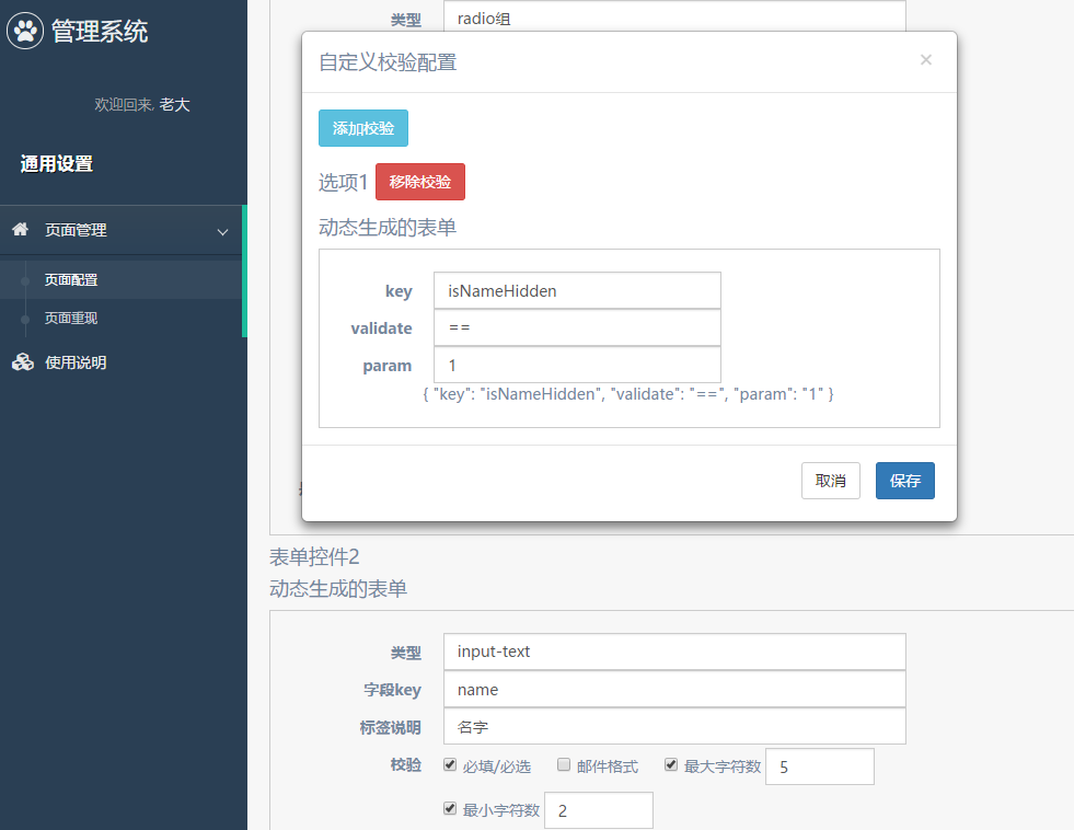
# hidden-when-dialog
我们的配置选项中,有一个是hiddenWhen参数,该参数也是通过配置多项条件的方式,这里我们也添加一个hidden-when-dialog来配置。
由于篇幅关系,这里只看看配置文件:
export const validationsFormControl: ICustomControl[] = [
  {
    type: "text",
    label: "key",
    key: "key",
    validations: [
      {
        type: "required",
        message: "key必填"
      }
    ]
  },
  {
    type: "select",
    label: "validate",
    key: "validate",
    validations: [
      {
        type: "required",
        message: "validate必选"
      }
    ],
    options: [
      { id: ">", text: ">" },
      { id: ">=", text: ">=" },
      { id: "<", text: "<" },
      { id: "<=", text: "<=" },
      { id: "==", text: "==" },
      { id: "===", text: "===" },
      { id: "!=", text: "!=" },
      { id: "!==", text: "!==" },
      { id: "indexOf", text: "indexOf" }
    ]
  },
  {
    type: "text",
    label: "param",
    key: "param",
    validations: [
      {
        type: "required",
        message: "param必填"
      }
    ]
  }
];
至于组件的 html 和 js 大家可以翻阅项目代码(在文章最后有链接)。
# 配置表单
# 表单的选项和结构
目前为止,我们的表单控件格式大致是下面这些:
export interface ICustomControl {
  type: string;
  label: string;
  key: string;
  validations?: IValidations[];
  options?: IOptions[];
  limit?: ILimit;
  hiddenWhen?: IHiddenCondition;
  description?: string;
  setOptions?: boolean;
}
我们需要添加一些选项或者是输入,来让使用的人生成以上的格式,然后生成想要的表单。 这里面需要详细配置的有:
validations- 校验方式,如
required、maxLength等 - 这里可以使用
checkbox-with-input的方式来配置
- 校验方式,如
export interface IValidations {
  type: string;
  param?: any;
  message: string;
}
options- 选项配置,当选择的类型
type需要配置选项时出现 type == 'select' || type == 'radio' || type == 'checkbox'等等- 前面的
option-dialog已封装该功能,并提供自定义表单使用,但目前只支持id和text的配置
- 选项配置,当选择的类型
export interface IOptions {
  id: string;
  text: string;
  withInput?: boolean;
  type?: "text" | "number" | "email";
}
limit- 图片校验,只当选择图片上传时使用
- 使用
checkbox-with-input的方式来配置
export interface ILimit {
  width?: number;
  height?: number;
  size?: number;
  type?: string;
}
hiddenWhen- 条件符合时隐藏,可配置多个条件,并设置多个条件的关系(
||或&&) hidden-when-dialog
- 条件符合时隐藏,可配置多个条件,并设置多个条件的关系(
export interface IHiddenCondition {
  condition: "||" | "&&" | "";
  validations?: IHiddenValidate[];
}
export interface IHiddenValidate {
  key: string;
  validate: string;
  param: string | number;
}
# 配置表单的配置
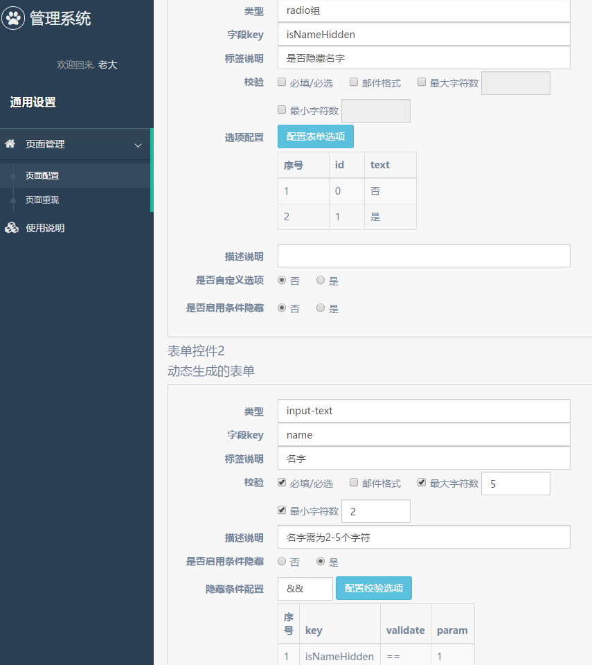
接下来我们来配置生成这样一个用来生成配置的表单吧:
export const normalFormControl: ICustomControl[] = [
  {
    type: "select",
    label: "类型",
    key: "type",
    validations: [
      {
        type: "required",
        message: "类型必选"
      }
    ],
    options: [
      { id: "text", text: "input-text" },
      { id: "number", text: "input-数字" },
      { id: "select", text: "select" },
      { id: "radio", text: "radio组" },
      { id: "checkbox", text: "checkbox组" },
      { id: "date", text: "日期" },
      { id: "date-time", text: "日期+时间(分钟)" },
      { id: "date-hour", text: "日期+时间(小时)" },
      { id: "upload-image", text: "图片上传" }
    ]
  },
  {
    type: "text",
    label: "字段key",
    key: "key",
    validations: [
      {
        type: "required",
        message: "字段key必填"
      },
      {
        type: "maxLength",
        param: 15,
        message: "字段key最多15个字符"
      },
      {
        type: "minLength",
        param: 3,
        message: "字段key最少3个字符"
      }
    ]
  },
  {
    type: "text",
    label: "标签说明",
    key: "label",
    validations: [
      {
        type: "required",
        message: "标签说明必填"
      }
    ]
  },
  {
    type: "checkbox-with-input",
    label: "校验",
    key: "validations",
    options: [
      { id: "required", text: "必填/必选" },
      { id: "email", text: "邮件格式" },
      { id: "maxLength", text: "最大字符数", withInput: true, type: "number" },
      { id: "minLength", text: "最小字符数", withInput: true, type: "number" }
    ]
  },
  {
    type: "checkbox-with-input",
    label: "图片上传限制",
    key: "limit",
    options: [
      { id: "width", text: "宽(px)", withInput: true, type: "number" },
      { id: "height", text: "高(px)", withInput: true, type: "number" },
      { id: "size", text: "大小", withInput: true, type: "number" },
      { id: "type", text: "类型", withInput: true, type: "text" }
    ],
    description: "类型限制可填 jpg | png | gif",
    hiddenWhen: {
      // 当选择上传图片组件才显示
      condition: "||",
      validations: [
        {
          key: "type",
          validate: "!=",
          param: "upload-image"
        }
      ]
    }
  },
  {
    type: "select",
    label: "选项配置",
    key: "options",
    options: [],
    hiddenWhen: {
      // 选择带选项组件显示
      condition: "&&",
      validations: [
        {
          key: "type",
          validate: "!=",
          param: "select"
        },
        {
          key: "type",
          validate: "!=",
          param: "checkbox"
        },
        {
          key: "type",
          validate: "!=",
          param: "radio"
        }
      ]
    },
    setOptions: true
  },
  {
    type: "text",
    label: "描述说明",
    key: "description"
  },
  {
    type: "radio", // 带选项的可配置提供自定义选项
    label: "是否自定义选项",
    key: "setOptions",
    options: [{ id: "", text: "否" }, { id: "withOption", text: "是" }],
    hiddenWhen: {
      condition: "&&",
      validations: [
        {
          key: "type",
          validate: "!=",
          param: "select"
        },
        {
          key: "type",
          validate: "!=",
          param: "checkbox"
        },
        {
          key: "type",
          validate: "!=",
          param: "radio"
        }
      ]
    }
  },
  {
    type: "radio", // 该字段用来判断是否启用下面配置,不作为最终生成的配置选项
    label: "是否启用条件隐藏",
    key: "withValidation",
    options: [{ id: "0", text: "否" }, { id: "1", text: "是" }]
  },
  {
    type: "hidden-when-dialog",
    label: "隐藏条件配置",
    key: "hiddenWhen",
    hiddenWhen: {
      condition: "&&",
      validations: [
        {
          key: "withValidation",
          validate: "!=",
          param: "1"
        }
      ]
    }
  }
];
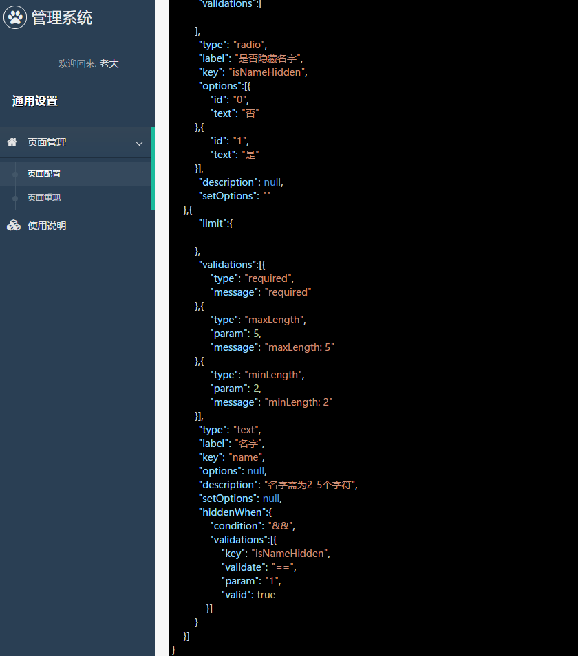
大家会发现,上面的配置并不完全可以得到我们最后想要的配置,如limit和options的格式,故我们最后还需要输出时调整:
    formJson() {
        const jsonResult = [];
        this.customForms.forEach(form => {
            // 取出需要使用的字段
            const {type, label, key, limit, validations, options, description, setOptions, withValidation, hiddenWhen} = form;
            const validationArr = [];
            const limitObj = {};
            if (validations) {
                Object.keys(validations).forEach(valid => {
                    const value = validations[valid].value;
                    let message = valid;
                    if (value != null) {
                        message += `: ${value}`;
                    }
                    if (validations[valid].checked) {
                        validationArr.push({
                            type: valid,
                            param: value == null ? undefined : Number(value),
                            message
                        });
                    }
                });
            }
            if (limit) {
                Object.keys(limit).forEach(con => {
                    if (limit[con].checked) {
                        limitObj[con] = limit[con].value;
                    }
                });
            }
            if (withValidation != '1') {
                hiddenWhen = undefined;
            }
            jsonResult.push({
                limit: limitObj,
                validations: validationArr,
                type, label, key, options, description, setOptions, hiddenWhen
            });
        });
        this.json = JSON.stringify({jsonResult});
    }
而我们的 html 模版长这样:
<div style="margin-top: 30px;">
  <h1>自定义表单配置</h1>
  <a class="btn btn-info" (click)="addControl()">添加表单选项</a>
  <div *ngFor="let form of customForms; let i = index;">
    <h2>表单控件{{i + 1}}</h2>
    <dynamic-form [config]="customControl" [model]="form"></dynamic-form>
  </div>
  <h1><a class="btn btn-success" (click)="formJson()">生成JSON</a></h1>
  <json-to-html [hidden]="!json" [(ngModel)]="json"></json-to-html>
</div>
# 配置生成表单
# 生成 json 展示
上面大家也看到了json-to-html,其实主要拿以前实现的其中一种方法来生成带样式的 json,具体实现大家可以参考《将 json 输出为 html(一):字符串正则匹配》 (opens new window)和《将 json 输出为 html(二):js 数据类型判断实现》 (opens new window)。
这里我们将它稍微封装一下:
@Component({
    selector: 'json-to-html',
    template: `
        <div></div>`,
    providers: [customInputAccessor(JsonToHtmlComponent)]
})
export class JsonToHtmlComponent implements AfterViewInit {
    @Input() options: object = {};
    @Input() isEdit: boolean = false;
    @Output() change = new EventEmitter();

    private editor: any;
    private el;

    private model: any = []; // 控件的值
    private onChange: (_: any) => void;
    private onTouched: () => void;

    constructor(el: ElementRef) {
        this.el = el;
    }

    ngAfterViewInit() {
        this.setValue(this.model);
    }

    setValue(value: any){
        if(value){
            this.el.nativeElement.innerHTML = JsonToHtml(value);
        }
    }

    writeValue(value: string): void {
        if (value) {
            this.model = value;
            this.setValue(value);
        }
    }
    // 其他照旧
}
# 读取配置
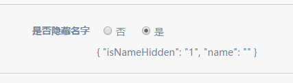
我们将上面生成的 json 复制一下,粘贴到一个地方,然后就可以生成想要的表单了。 这里配置读取很简单:
<div style="margin-top: 30px;">
  <h1>自定义表单生成</h1>
  <div>
    <h2>输入json</h2>
    <textarea [(ngModel)]="json"></textarea>
    <h2><a class="btn btn-success" (click)="buildForm()">生成表单</a></h2>
  </div>
  <div>
    <dynamic-form *ngIf="isShown" [config]="customControl"></dynamic-form>
  </div>
</div>
使用*ngIf主要是方便控制[config]的输入更改的时候重新生成,因为自定义表单通常不会动态改变,故我们不将该功能拓展进去。
生成配置也很简单:
    customControl: ICustomControl[];
    json: any;
    isShown: boolean = false;

    buildForm(){
        this.isShown = false;
        const config = JSON.parse(this.json);
        this.customControl = config.jsonResult;
        this.isShown = true;
    }
这样,我们就能实现表单的创建和生成啦。效果图如下:

# 结束语
项目中表单配置部分大致的实现也是差不多告一段落啦,后面可能更多的是补充和优化而已。
而其实项目还可以多种拓展呢,像这样的添加配置像(validations 和 hiddenWhen)也可以通过抽象做成更加通用的功能。
此处查看项目代码 (opens new window)
此处查看页面效果 (opens new window)