该系列用于探索一些 Angular 中灵活或者新的用法。本文结合前面的响应式表单和动态表单,讲述继续拓展 radio 和 checkbox 表单选项的过程。
# 动态表单与自定义 input 控件
# 自定义 input 控件
前面有较详细讲解自定义 input 表单过程,参考《5. 自定义 input 表单控件》。 过程无非是将 Angular 原本的双向绑定过程抽离出来,自己定义实现而已。通过 Angular 提供的一些接口,还是很容易达到想要的效果的。
这里我们再拓展两个:radio和checkbox类型的 input 控件。
radio
通常我们使用 radio,除了双向绑定的ngModel之外,还有的大概就是选项了。
选项我们使用统一的数据结构{id:id, text:text}。
结合前面我们抽象出来的CustomInputComponent和customInputAccessor,实现radio-group还是很简单的,如下:
import { Component, Input, Output } from "@angular/core";
import {
  CustomInputComponent,
  customInputAccessor
} from "../class/custom-input.class";

@Component({
  selector: "radio-group",
  template: `
        <span *ngFor="let op of options" class="form-check">
            <input type="radio" [(ngModel)]="value" [name]="value" [disabled]="disabled" [value]="op.id" />{{op.text}}
        </span>`,
  providers: [customInputAccessor(RadioGroupComponent)]
})
export class RadioGroupComponent extends CustomInputComponent {
  @Input() options: any[] = []; // object: {id, text}
  @Input() disabled: boolean = false;

  constructor() {
    super();
  }
}
checkbox
而要实现checkbox就稍微复杂一点,毕竟我们不能直接使用ngModel来双向绑定。
这里我们约定以数组方式返回选中的 id,以上的通用 class 不能直接使用,我们需要调整双向绑定的过程。如下:
import {Component, Input} from '@angular/core';
import {customInputAccessor} from '../class/custom-input.class';

@Component({
    selector: 'checkbox-group',
    template: `
        <span *ngFor="let op of options" class="form-check">
            <input type="checkbox" [name]="value" [checked]="model.indexOf(op.id) > -1" (click)="setValue(op)"
                   [disabled]="disabled" [value]="op.id"/>{{op.text}}
        </span>`,
    providers: [customInputAccessor(CheckboxGroupComponent)]
})
export class CheckboxGroupComponent {
    @Input() options: any[] = []; // object: {id, text} or array: []
    @Input() disabled: boolean = false;

    private model: any = []; // 控件的值
    private onChange: (_: any) => void;
    private onTouched: () => void;

    // 设置checkbox值
    setValue(option: any) {
        const {id} = option;
        const index = this.model.indexOf(id);
        if (index > -1) {
            // 有则移出
            this.model.splice(index, 1);
            this.onChange(this.model); // 需更新绑定的值
        } else {
            // 无则添加
            this.model.push(id);
            this.onChange(this.model); // 需更新绑定的值
        }
    }

    // 以下接口基本一致
    onBlur() {
        this.onTouched();
    }

    writeValue(value: string): void {
        if (value && value.length) {
            this.model = value;
        }
    }

    registerOnChange(fn: (_: any) => {}): void {
        this.onChange = fn;
    }

    registerOnTouched(fn: () => {}): void {
        this.onTouched = fn;
    }
}
到了这里,是不是大家的自定义 input 控件技能又提升了。
# 动态表单与自定义 input 控件
大家会不会很好奇,我们自行封装了这些自定义 input 控件,要怎么使用呢?
其实很简单,我们跟其他原生的 input 一样使用就好了,使用一个formControlName就可以很方便地跟formGroup结合起来了。
这里我们把目前为止所有封装过的自定义 input 都放进来检验使用:
<form
  class="form-horizontal"
  [formGroup]="dynamicForm"
  (ngSubmit)="submit()"
  style="border: solid 1px #ccc; padding: 20px 0;"
>
  <div *ngFor="let control of config" class="form-group">
    <div class="form-group">
      <label class="col-md-2 control-label">{{control.label}}</label>
      <div class="col-md-6">
        <input
          *ngIf="control.type === 'text' || control.type === 'number'"
          [type]="control.type"
          class="form-control"
          [formControlName]="control.key"
        />
        <select2
          *ngIf="control.type === 'select'"
          [options]="control.options"
          [formControlName]="control.key"
        ></select2>
        <radio-group
          *ngIf="control.type === 'radio'"
          [options]="control.options"
          [formControlName]="control.key"
        ></radio-group>
        <checkbox-group
          *ngIf="control.type === 'checkbox'"
          [options]="control.options"
          [formControlName]="control.key"
        ></checkbox-group>
        <date-time-picker
          *ngIf="control.type === 'date'"
          accuracy="day"
          [formControlName]="control.key"
        ></date-time-picker>
        <date-time-picker
          *ngIf="control.type === 'date-hour'"
          accuracy="hour"
          [formControlName]="control.key"
        ></date-time-picker>
        <date-time-picker
          *ngIf="control.type === 'date-time'"
          accuracy="day"
          [formControlName]="control.key"
        ></date-time-picker>
      </div>
    </div>
    <div
      *ngIf="formErrors[control.key]"
      class="alert alert-danger col-md-6 col-md-offset-2"
    >
      <p>{{ formErrors[control.key] }}</p>
    </div>
  </div>
  <div class="col-md-offset-2">
    {{dynamicForm.value | json}}
  </div>
  <div class="form-group">
    <div class="col-sm-offset-2 col-sm-10">
      <button
        [disabled]="!dynamicForm.valid"
        type="submit"
        class="btn btn-info"
      >
        提交
      </button>
    </div>
  </div>
</form>
然后我们调整输入:
// dynamic-form.config.ts
import { ICustomControl } from "shared/component/dynamic-form/dynamic-form.component";
export const customForms: ICustomControl[] = [
  {
    type: "text",
    label: "名字",
    key: "name",
    validations: [
      {
        type: "required",
        message: "名字必填"
      },
      {
        type: "maxLength",
        param: 8,
        message: "名字最多8个字符"
      },
      {
        type: "minLength",
        param: 3,
        message: "名字最少3个字符"
      }
    ]
  },
  {
    type: "text",
    label: "Email",
    key: "email",
    validations: [
      {
        type: "required",
        message: "Email必填"
      },
      {
        type: "email",
        message: "Email格式不正确"
      }
    ]
  },
  {
    type: "select",
    label: "职业",
    key: "job",
    validations: [
      {
        type: "required",
        message: "职业必选"
      }
    ],
    options: [
      { id: "", text: "" },
      { id: "1", text: "医生" },
      { id: "2", text: "程序员" },
      { id: "3", text: "公务员" },
      { id: "4", text: "其他" }
    ]
  },
  {
    type: "radio",
    label: "性别",
    key: "gender",
    options: [
      { id: "male", text: "男" },
      { id: "female", text: "女" },
      { id: "", text: "未知" }
    ]
  },
  {
    type: "checkbox",
    label: "爱好",
    key: "hobbit",
    options: [
      { id: "1", text: "运动" },
      { id: "2", text: "看书" },
      { id: "3", text: "音乐" }
    ]
  },
  {
    type: "date",
    label: "生日",
    key: "birthday"
  }
];
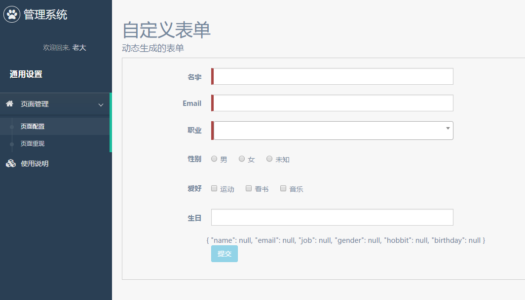
效果图如下:
# 默认值加载获取
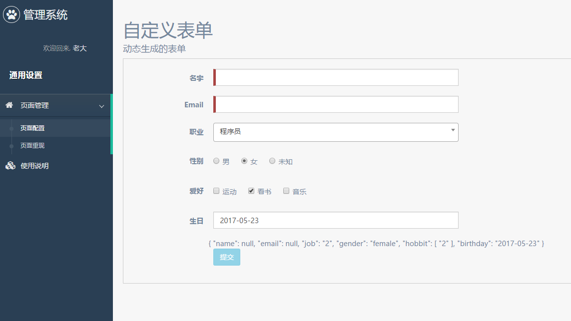
为了检验我们的初始值能否正确加载,我们添加默认值:
// dynamic-form.config.ts
export const customFormsDefault = {
  job: "2",
  hobbit: ["2"],
  gender: "female",
  birthday: "2017-05-23"
};
同时我们注入到控件:
<dynamic-form
  [config]="customForms"
  [model]="customFormsDefault"
></dynamic-form>
效果图如下:
# 结束语
目前我们能很方便地拓展需要的动态表单,来做一些配置化的东西。
而当我们真正在项目中使用的时候,或许还需要考虑从接口获取数据(初始值)的情况,不过解决办法也有很多,大家多去实践吧。
此处查看项目代码 (opens new window)
此处查看页面效果 (opens new window)